Conferences

Build Conference 2012

It was a predictably wet day in Belfast. I made my way into the town centre, passing large banners proudly displaying the Build identity, and met other Buildees for a co-working session.

Over the course of the day we had interesting discussions about our approaches and challenges with our work as web designers. Responsive design was a topic we returned to often, discussing our solutions to the challenges of the design process and especially prototyping designs in a responsive way.

The hub of Build was the Black Box where that afternoon some designers talked about their passions outside of work. I am obsessed with making things, and although I love my job I am rarely on a computer after work or on the weekends. This multi-disciplinarily creative approach was a real focus at Build and permeated everything. (Why else hold an axe-making workshop at a web design conference?) The afternoon talks were a really honest glimpse into their creativity outside of work and it was fascinating to see how that varied and where it met their designs.

Oh, and that night our team came second in the Standardista’s Open Book Exam. Sweet.

The next day everyone gathered at the Waterfront for the full conference day. The talks remained on topic with the Build theme: creativity filled with passion and craftsmanship. There was a strong sense of the web entering a more mature phase of development and what that may mean as we map out a new era.

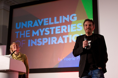
Mandy & Tiffani came from content backgrounds, but their talks on editing and being true to yourself should be applied cross-discipline. Reshaping a work while remaining true to it and telling an honest story about yourself are both super relevant to all of us.

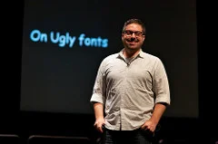
Kirby’s talk, Everything is a Remix, was really reassuring about the critical stage of reusing that happens in creative processes. Let’s face it, we all do it, but it can often result in feeling that we are not ‘creative enough’ as we appropriate other people’s work. Remixing is an inevitable part of idea generation and should be used to enhance the source and the result.

Jeff Veen is a natural storyteller. His engaging talk about his teams at Typekit had so much in common with the team I’m part of at uSwitch, I feel really fortunate to make that statement. His final topic of Design/Product Reviews was really helpful as it’s an area we haven’t got right yet (evident in all of ourinconsistencies) and I’ve come away with some great ideas to try with the design team.

Ethan’s talk at the end of the day was super relevant to a project we’re working on with Restless Development in Uganda, where our audience could very well be in rural areas using a shared mobile phone accessing our service via WAP or SMS. By having such strict technical requirements it forces you to focus the service and full accessibility is a must. But even with our other projects – where I’m loving creating such image-rich designs – we have to remember that a significant number of our visitors are struggling on Edge mobile internet or overloaded broadband connections and they won’t see what I’ve lovingly laid out in Photoshop. I have to be ok with that – but how do I balance it with striving for quality experiences? Does quality just become relative?

The Build experience has been fantastic – we’re all buzzing and have a lot to continue thinking about, discuss and explore. Build 2013 is the final year for this amazing conference, make sure you get your ticket!

The beautiful photos on this page are by Al Power.

Will Hudson talk at London/CM hosted by Google

2012/07 Will Hudson from CreativeMornings/London on Vimeo.

Ok, we admit that a big part of going to this Creative Morning talk was to see the Google Campus space designed by the same interiors company as our office. It's a beautiful space with a great cafe downstairs. But no one was disappointed with the talk either. Will's focus on the power of a brand was really inspiring to me, as we are facing many issues from a stagnant brand while redesigning uSwitch.com. To see how he has shaped businesses from such an emphasis on a core principle, and how that doesn't close his scope but allows him to expand his horizon from a magazine, to a shop, events, and who knows what's next... a pub?

Peter Gregson at London/CM

2012/05 Peter Gregson from CreativeMornings/London on Vimeo.

One of the things I've always like about Creative Mornings is the diversity in the scope of the events. It's not just about the discipline of design - it's anything to do with creativity. The areas that Peter is exploring in his music and blending it with technology has a lot of similarities to our work, and I especially liked his emphasis on the technology working for us, not creativity working around technology. This is a super important point to remember in user experience design; it's worth going the extra mile technically so the experience is seamless for the user who is not even aware of the complexity involved.

Future of Web Design, day 2

The second day of FOWD NYC somehow managed to trump day one, which was already so fantastic. The morning got off to a great start with Cameron Moll encouraged us to push ourselves into areas where we're not comfortable and to go ahead and make mistakes. He was followed by Whitney Hess who suggested that we look at some Principles of UX to ensure that our designs provide excellent experiences. Dave Shea's talk on the future of CSS was really exciting for me, I secretly geeked out learning that things like nth child can finally be supported, 5 years after I first learnt and tried to use it. He focussed on the lesser known aspects of CSS3 and suggested that it's time to drop a lot of the vendor prefixes. He also introduced some CSS4 stuff, and concepts like the Shadow DOM which will allow us to style browser-rendered items (welcome back coloured scroll bars!) There are some new layout options being developed, but I can't say any of them really grabbed me. He also gave a little warning that using a lot of CSS3 things on the page can significantly slow down the browser rendering, so we do need to still use these with caution even though it's created via CSS. Having lunch with Dave was a real highlight of the day, he is definitely a super talented person.

Looking at the Future of Mobile UX with Steve Fisher was actually not so much about mobile... he encouraged us to think of sites and that it's no longer about the devices themselves that people use to view it. These sites need coherence, but do not need to be the same as each other. We should look at patterns in the medium people are using, and remember the moment that people are using them in by mimicking things that people are used to already using on that medium (for example, allowing the keyboard to slide away on an iPhone as you can in the messaging).

I loved the talk from Randy Hunt, Creative Director for Etsy, especially as we are working on developing the brand at work right now. He emphasised that manufactured brands show and create a lack of trust, so it's ultra important that the brand is a genuine reflection of the values of the company and what is already happening. The control of this is already being given over to the customer or community around the company, and this is going to continue to grow - we can only try to nudge it in a direction and listen to what the community is saying. Smart content, an honest story and a memorable personality holds it together. I managed to talk to Randy after the talk to get some more detail, as obviously Etsy is a great brand that is already leaning towards these things, and he strongly recommended the book The Brand Gap.

The day ended on a high with Joshua Davis. As someone who loves creating with textiles, I really loved his approach to offline work and realising that computers are only a tool, nothing more. Stay human, stay analogue, and we retain a warmth to our work that cannot be obtained otherwise. As designers, let's stay teachable (no complacency!), opinionated (but no ego and not arrogant), and have faith in yourself.

There were 2 streams and I didn't make it to every talk, so for a different take on the conference, check out Sophie's excellent blog post. I met so many great people at FOWD NYC and felt that it was such a great setting for a design conference; it was really worthwhile making the trip for it :)

Future of Web Design New York

As I walked around the streets of New York I realised just how strong the design culture is here, evident in every independent coffee shop and boutique store. This place definitely has its own aesthetic like no other city I've visited yet. This is what makes it such a great city to have a web design conference in. The day at FOWD NYC started with Kevin Systrom taking about how Instagram has become the success it is today. By realising the context of mobile use and the amazing features of the phone available to them, they were able to focus on what seems like silly features of their mission statement to create this great, well-tuned app. Through such quick discovery of the Instagram magic to the addictive nature of the social aspects, Instagram is one example of an app done perfectly.

Josh Clark gave a great talk on the myths of mobile context. Mobiles should be viewed as cultures and this does not always mean less, just more focused on the things that really matter in this situation. We need to retain a level of complexity, but without the complication. This can be done very effectively with content only a tap away, and exploring these interfaces can become exciting and interesting to the user. If we start with content, then mobile is just a different way of digesting it - with a smaller screen size but with richer features. Content should be neutral and there is an expectation forming that it should flow (think iCloud). So when designing we need to be thinking of content and design strategies, not layouts for each situation.

Sarah's talk on web design being a cloud was very inspiring to me, and I feel is at the heart of my day to day work. It's a little difficult to explain her talk in this short post, but it boiled down to establishing clear, honest and personal communication within your team from the outset.

The last talk of the day was Swiss Miss, Tina Roth Eisenburg. She went through points good for anyone in the design industry and was very inspirational. She encouraged everyone to get into side projects and used examples from her own. It was a delightful way to end the day and it was great to meet the person behind Creative Mornings that we've been hosting in London.

I've met so many cool people today, web designers and developers from all areas of the industry. We had a great dinner with a bunch of them, and I'm looking forward to what tomorrow brings!

Typo London

Eva Lotta Lamm


The set up for Typo seemed to be 'save the best for last'. Over the 3 day conference, I found Saturdays speakers to be the best of all, and nothing could beat Chip Kidd. His tales of his projects, how he'd arrived at the final outcome, and including the ones that had become 'failed' projects was very insightful coming from such a well regarded designer. Other highlights included the project of the King of Ghana's visual identity, Pixar's process of creating movies (especially how they consider lighting, colour and mood to evoke emotions in the viewer) and Eva-Lotta's process of creating sketch notes. Her London UX sketch evenings are a great idea, and I will be going along to the next one I can. Jeff Faulkner from Xbox had a very interesting talk about the future of UX design, it was packed full of thought provoking points, and one I will be watching the video of again. The speakers are such a creative bunch and I got a lot of inspiration from their talks. My day-to-day working environment is very data orientated so was nice to be encouraged in the direction of the softer stuff - how to create emotional responses in people, and how valuable this is in the design process. I met a few interesting UX people, although I do wish conferences would provide food to encourage more networking as it's more difficult to meet people when everyone disperses for breaks outside of the venue. But other than that, we had a great few days and I am looking forward to putting these things into practice!

Image: Eva Lotta's talk on sketchnotes. Credit: TYPOworkspace

David McCandless at CM/London

2011/10 David McCandless of Information is Beautiful from CreativeMornings/London on Vimeo.

Having David McCandless to speak at Forward is a perfect match. We work in such a data-focussed company and here is one of the biggest names in infographics and visual presentation of data sharing his stories, experience and top-tips. I think Forwardians at least half-filled the auditorium space at this super popular talk - it's been a fantastic morning (despite some continued technical hiccups... we'll have them ironed out for the next CM we host!)

Design Jam London

Yesterday I went to my first Design Jam, a one-day event for web designers and usability experts. I am so glad I went along, I think we had a greatteam and a great idea. We worked on rapid wireframes, user research, personas and user flow diagrams.

user journeys
Wireframing
Home page
Musician screen after logging in

I wanted to produce a layout for the presentation, so I whipped something up in PS while the others put the finishing touches on the presentation. We didn't get time for any quick user tests which was a shame, but overall we had a ball and were very happy with our outcome from the day. The other teams had great ideas and I loved the theme that arose of an app related to your location, not necessarily web based. Perhaps we're seeing the first changes of people wanting to make their online lives smaller and more meaningful?

Our team's tumblr feed » Other teams feeds: Team 1, Team 3, Team 4, Team 5, Team 6, Team 7, Team 8, Team 9 & Team 10.

Ampersand conference

I was especially looking forward to Ampersand today because web typography is growing so quickly and conferences are such a great way to learn a lot in a short time.

Some of the talks (like Jonathan Hoefler) were brilliant. There was a huge round of applause to the news that the entire Hoefler & Frere-Jones library will be released soon for web use - it's great news because their typefaces are such good quality and it was obvious how much work had gone into each one, and making it useful for web. I feel like I have left the conference with a better understanding of how fonts are put together and crafted. Although it was a shame we couldn't stay for the party, I was so excited about creating great type on the web that I couldn't help but whip something up on the train back :)

Image of Jason Santa Maria by stn1978

New Adventures in Web Design

I was excited as I headed up to Nottingham, I hadn't visited the city before and I was making the trip to attend New Adventures in Web Design.

The day was full of great talks with a strong underlying theme of introducing "higher" design into our work (I hate that term, but bear with me). This includes using art direction to focus and evoke emotional reactions, traditional print methods such as baseline grids to form a vertical rhythm, and making strong conscious decisions about every element we add to a design instead of relying on old tricks and trends. A lot of this we have already been discussing between ourselves at work, but it's great to hear it from industry leaders; and it was a good reminder of university study.

If I had to choose a favourite it would be Brendan Dawes' presentation. Not only because he's an amazing and entertaining presenter, but because he has been looking at how the web will connect with real world things, such as his script for automatically printing photos from instagram which allows us to discover the imagery in a different way. As I am very active in crafting physical things in my spare time I find this connection fascinating and is something I have not considered before. But it has great implications on how we may obtain and consider goods in the future, hopefully with less waste and more respect for the way things are made and what happens to them when we no longer want them.

But of course one of the best things about conferences is meeting new people and catching up with those you met previously. This conference was even better for that because there was no wifi - it may sound weird for a web conference to have no connection but it meant people left their laptops away and actually talked to each other. What a great idea!

Photos from the conference on flickr...

Photo credits to Andreas Dantz and Marc Thiele.

FOWD conference 2010

I've just spent 2 really awesome days at the Future of Web Design conference. John Hicks talking about Icon Design

The talks were awesome, in particular I got a lot out of the sessions on Emotional Design and User Testing; and the jQuery for Designers information will also be really useful. It was great having the design clinics and hearing Mike Kus' review of my work, I really respect him as a designer so it was a great opportunity. The whole format was much better than last year, and gave much more opportunity for networking. Odd fact: Ryan Carson is crazily tall, and being rather short I felt like a dwarf talking to him!

Most of all I'm excited about all of the things I want to try out and do now. Things like unfinished ideas for this blog that I didn't want to use Flash for are now possible with CSS3... oh so many ideas you'll just have to wait and see! I also met some really awesome people, it's very cool to talk to other web designers from different areas, share challenges and have fun!

I've done some more detailed write ups on the work blog, check them out: FOWD Day 1 and FOWD Day 2.

FOWD

The reception areaGraphic Design posterToday I went off to FOWD, I really like conferences because they just encourage and inspire you to do new and better things.  This was especially good because it was all about design and the stuff that I do day-to-day!  So there was Danny Sohmekh talking about Agile design processes, Jim Coudal talked about harnessing creativity, and Good Barry presented on how to communicate your skills in a society where design and websites are commodities.  My favourite presentations of the day were definitely Mike Kus' beautiful slides (supporting his talk about the importance of graphic design, the slides were very inspiring!) and Mark Boulton's talk on typography which is an area that I always want to learn more about. Microsoft did quite a cool story telling using their surface display which was fun. One of the best bits about it tho was meeting up with some other London web designers... I hope we can continue to network in some way, as being the only designer at work does have it challenges sometimes!

All of the presentations are now available for download; if you couldn't come along then definitely check them out.

Interaction design goodness

Today I'm at Amy Hoy's workshop on interaction design. They have wifi in the workshops *yay* it's so nice being connected through the day! Before morning tea she covered the basic principles of usability and interface design. Out of the three layers of interface (Expectations, Direct interaction and Behaviour) the only thing that designers can have an impact on is the direct interaction layer. And the whole thing with usability is not a science, but relevant to the audience and people who use the site or application.

Initial principles cover basic layout such as top to bottom and left to right orientation (e.g. typically a logo should be in the top left as that is the most prominent area). This also applies a lot to sidebars - left sidebars get tuned out a lot – and although they do not interrupt reading flow, they also do not command attention (navigation blindness). Right side bars are hard to tune out – which can be good or bad. They interrupt with reading flow, especially if jagged edge on right. Bad to use if centre content is critical, but good for attention.

Without sidebars the content is much more readable. She suggested picking one sidebar layout – they both have different properties so test with your audience. Without sidebars, the content is a lot more readable - and if you need to have columns try to keep it to one sidebar.

Website visitors often just simply satisfice - choose the closest option to what they're looking for. This is really bad for experience, making it very hard to find information or reach your goal. Things need to be obvious and at surface level.

When designing a website (and by that I mean information and structure, not just graphic design) try very hard to make your priorities the same as the visitors.

Visual perception (e.g. Colour, Shape, Size) can be more predicable and easier to measure (based on Western society). Things like the colour red = stop, warning, no, error. In this area, conventions are good and should be used to avoid confusion.

And over and over again she emphasised that all of this is relevant to audience and their experiences. It's not an exact science and theory will not provide all the answers we need. Studies, research and analytics are not a substitute for thinking and testing. Real life is difficult to measure and people are complex. Target your audience, not using generic reports where you don't know the content, or the people, etc. It's not until you get feedback from your visitors that you can start to gauge effectiveness of your design.

Form design – the most dreaded beast. Always ask first: do you really need a form? They are hurdle for users, eliminate them where possible. What can you eliminate? Do you need to ask their country - or can you use the IP address and then check that your assumption is correct? Remove the barriers.

Breaking a form into sections creates a sense of accomplishment. Inline written content is useful, e.g. "I rate this at [option] out of 10".

Error messages are a classic mistake of form design. Often they are poorly written and not helpful. Again, try to remove as many barriers as possible - use red, make them jump out, position them next to where the fault is and ensure they are written well. Even better - eliminate the use of error messages by just dealing with the "incorrect" input. For example if a message in Twitter is too long, they just trim it down and let you know for next time. Gmail has an undo feature for deleted messages.

We want to leave a positive and fun impression on visitors so that they come back, recommend it to friends, etc. However, the way we remember things is not how it really happened – things are rarely as direct as we remember. The beginning and end are the most memorable to people. Negative things are also more memorial than positive things.

She wrapped up the day challenging us to not get locked into method, but instead look at things creatively. This allows for truely new innovations, for example the iPhone was never user tested outside of the Apple team working on it - and yet it is such a successful and wonderful interface. Don't lock out innovation with convention.

Amy Hoy's site with the list of links from her presentation.

Webstock mini

Last night Webstock had a mini conference, a 5-9pm thing with three speakers and networking drinks between. It was really fun! It was great to catch up with CJ, Natcol people and meet new people like Dale. And the speakers were all really great!

First up was Natasha Hall who talked about some usability examples on Trade Me. She had a huge line-up of their top traders who they had visited to better understand how they use Trade Me and manage their business selling on there. I was really amazed at just how much some people earn on there, the average gross income of her examples was like $700k!

Russell Brown then stepped through his recent trip to California, and ohhhh I wanna live in San Fran now!! LOL I'm so easily impressed, but it was a very exciting talk because it seems that there are just so many possibilities and initiatives there that are made possible by funds that are so much harder to get here in NZ.

And last, but no way near least, was Nat Torkinton who talked about 7 points of Web 2.0. Over the last few months I have been getting throughly sick to death of this buzz-word, especially when it is mis-used by marketers who have no idea what they are talking about. But Nat's talk was really great because he sought to clarify "Web 2.0", with real emphasis on the sharing of data and cross application of it.

It was a thoroughly good night! The next large Webstock conference isn't going to be until 2008, but there will be many smaller events such as this through 2007 - a great idea and I'm going to look forward to each one!! :D

Web Directions Day 2

Andy Clarke's presentation was a great way to kick of WD Day 2 - he talked about Creating Inspired Design, really pushing creativity for all members of a team, even code developers. How can we use design to convey a deeper meaning about the website? And how can we start to think outside the square of web design into the level of creativity that you see in strong Flash designs? These days the tools are no longer a hurdle, our imagination is the limit (although I think he may have been thinking ahead a bit to IE7's release ;) ). One idea I especially liked is the collecting of anything that inspires you creatively - like keeping a scrapbook. It has been a long time since I have done this, and after his presentation I took a little crappy disposable camera and took shots of everything! The highlight of the day was meeting up with Andy over morning tea. We had a quick wee talk about stuff, but I can't believe it - he remembered me from leaving this comment on my blog!! Then after that he editted the connection thingee to say crush and cute lady! Cheeky!

Laurel Papworth's presentation on the business of online communities was great, there were some really good stats there that I shared with the others; such as 9 times more visits that last for 5 times as long when you have a genuine online community on your website.

Jeremy Keith did a presentation of implementing unobtrusive Javascript practices with AJAX (aka HiJAX). I found this really valuable as I have spent so long teaching myself the best practices with CSS and seeing the major advantages that come of seperating presentation and strucutre, I would love us to apply these theories to the Javascript too. I just wish that Damian was there to see this presentation, cause I don't think he believed Kirti and I LOL! ;)

Poor Kelly Goto was loosing her voice by this stage!! However she powered on and gave a brilliant presentation on using the SCRUM practices alongside her Workflow practices. I first saw Kelly a year ago at the Web Essentials conference, and since then we have changed the way we approach our projects entirely. So it was very interesting to hear her developments, and I'm really looking forward to getting some time to look further into the SCRUM stuff. This is where you break your projects into three week blocks and at the end of each block there is a working functional result. She also gave a few more pointers on how to implement this succesfully.

What an awesome conference!! We didn't want to leave...! :( Kirti and I were too late to the after party though :( because we kinda got distracted by the shopping en route *blush* but I bought a really cool top for $10! *blushes more*

Web Directions Day 1

Day one of Web Directions conference was awesome! There was a lot of focus on microformats, accessibility and workflow; but here are my favourite points: Kelly Goto kicked off with a great keynote focussing on understanding your audience and the possibilities of the future (what about one personal avatar and setting across all apps, all hardware you own so you only have to update it once if you want to change).

Jeremy Keith did an awesome intro to AJAX. For a designer like me who is not into programming it was very useful. It was also nice to see that our using AJAX so far in Go Fetch is appropriate - not too much, but enough to make it easier to use (although we still have more to implement). Always ask yourself why an I using this - why is it useful? why does it make a good difference?

The Campaign Monitor guys talked thro what they had found developing their apps. A lot of this was directly tanible to us developing our apps and in particular Go Fetch - a small team building an app on the side for a specific use.

Unfortunately the catering and venue isn't as good as last year IMHO, as the whole thing is quite spread out on the UTS campus. But the reception tonight was good an it was really cool to meet more faces over some good nibbles and drinks!

Now it's time to hit the late night shopping ;)