FOWD conference 2010

I've just spent 2 really awesome days at the Future of Web Design conference. John Hicks talking about Icon Design

The talks were awesome, in particular I got a lot out of the sessions on Emotional Design and User Testing; and the jQuery for Designers information will also be really useful. It was great having the design clinics and hearing Mike Kus' review of my work, I really respect him as a designer so it was a great opportunity. The whole format was much better than last year, and gave much more opportunity for networking. Odd fact: Ryan Carson is crazily tall, and being rather short I felt like a dwarf talking to him!

Most of all I'm excited about all of the things I want to try out and do now. Things like unfinished ideas for this blog that I didn't want to use Flash for are now possible with CSS3... oh so many ideas you'll just have to wait and see! I also met some really awesome people, it's very cool to talk to other web designers from different areas, share challenges and have fun!

I've done some more detailed write ups on the work blog, check them out: FOWD Day 1 and FOWD Day 2.

*I love my new scrapbook!*

My Image Spark scrapbook Being online every day I have a slight issue as a designer. I can't keep a traditional visual diary very easily, unless I print every image or colour scheme I like out; which I don't want to do in order to save paper.

On the Mac at home we use LittleSnapper to keep track of cool images and stuff, but I'm on a PC at work, and also use more than one machine. One day I came across Image Spark and I was very happy! It also has a Firefox plugin so that when you find an image you like, you just right-click and voila - it's now in your Image Spark scrapbook. Now that I've been using it for a while, I'm starting to see trends coming up in my choice of images, my style :-)

My scrapbook »

Designing the Datadial website

I always find that designing your own website is a much larger task than designing a site for someone else. You become the pickiest designer ever, striving for the tiniest details to be spot-on and investing a lot of energy, but then receiving a lot of energy back when the results work out just as you hoped.

Our aims for the new site are to make it much more visually appealing, demonstrating our design work within the site itself. The structure was changed entirely to give ultimate focus on the full-service aspect of our business – that clients can use all of our services or just the particular ones they need.  We researched what our clients thought of us, and wanted to bring the website in line with the recurring aspects of the feedback:  we embark on a journey with our clients (we don’t just launch a site and leave it), our work yields results, we’re proactive and push expectations, clients talk directly to the people working on their site, and we’re a close knit team of specialists.

The old website


I think we’ve achieved all of this in the new design. Here are the main aspects that went into it:

Fonts – the Big Decision

The font choice underlies everything else in the design.  We wanted to move away from the Georgia look of the previous design, and needed something that communicated high-tech modernism and intelligence more effectively.  I also really wanted to take advantage of the @font-face CSS property so that we could just our chosen font in a wider variety of situations. (sIFR tends to restrict you to using the non-standard font only for headings – unless you want multiple headaches.)

@font-face technology is moving very quickly thanks to sites like Typekit, however there is still a long way to go.  The choices of fonts available are still relatively small, especially when it comes to fonts that have been engineered specifically for screen use.  Ideally, we also wanted to choose a font that could be rolled out in our printed documentation for consistency.

After a bit of research I found Graublau Web.  It is a lovely font that communicates all of the values we wanted to capture.  It is produced by a quality foundry; there is a specific screen/web version; it’s licensed for @font-face implementation; and is part of a wider print-based family that we can purchase for our hard copy material.  Tim Brown’s demo page meant that we could check out how the font behaved in different browsers before implementing it.

I was chuffed to say the least!

The Grid

The site adheres to a 12px grid to give it comfortable vertical-rhythm.  All of the font sizes, line heights and margins on headings and paragraphs are multiples of 6, which means the eye can easily jump from one item to the next down the page without any jarring of irregular spacing.

Consistency of design and uniqueness of pages

With such strong underlying consistencies through the design, we could then branch out and have a bit of fun with other elements such as the background colour of the page.  With dark backgrounds and the bright orange of the Datadial brand, we had to be very careful that content on the page was not being swallowed by the strong contrasting colours.  Having the ability to change the background colour on the page released us from that.


We developed a base colour scheme to avoid any clashing choices arising in the future. But I didn’t want to hinder our creativity with brand guidelines that are too restrictive, so we also allowed pages to have individual CSS files on the site. This means we can really branch out if the content warrants it. This will be an ongoing task, but 2 examples are Sexy Panties and Naughty Knickers and exemplifying the stunning Hope and Greenwood brand.

Transparency

I’ve always been one for subtle design effects. I believe the details add up to a sense of a good experience, even if the visitor isn’t fully aware of the individual details.

The site uses CSS3 transparency throughout it to give a different impression on individual pages.  By setting the content area to white with 90% opacity, each page has a slightly different tone: the equivalent of setting the page area to #ECEBEA, #EBEBEB, #EDECEB.  The navigation, social links and footer use the same effect with a black base.

What about Internet Explorer?

Thankfully, our site has a relatively low (and hopefully ever-decreasing) number of visitors using Internet Explorer.  This allows us to fully take advantage of CSS3 and provide Internet Explorer users a suitable fall back without compromising the majority of our visitors.  So instead of subtle transparency there is a normal solid colour background (always #EEE), instead of text shadows the text sits on the page as normal, and Javascript takes care of the text columns.


It may not look quite as pretty, but with the majority of our visitors able to see my full intentions without having to wait for Javascript to load, I feel the use of CSS3 pays itself off.  I also try to remain optimistic – hoping that IE9 will look just as good as Chrome or Firefox does right now, and therefore future-proofing the design.

New website

One of my friends, Sokha Nhim, has just started her own business in tailored formal wear.  She was going to launch a website for herself from iWeb... but I couldn't stand the thought of it and so I whipped one for her in my spare time instead! Sokha's website

I'm happy with the design - it's very suitable for her audience and was quick to do and has a lot of scope for future development with the content.

As yet, she still has a whole range that has not been shot yet.  Currently she's working on 3 beautiful flower girl dresses, and we're going to shoot those at the final fitting, and after that hopefully get her remaining pieces up in the gallery.

Beautiful Bank Holidays!

View of London from Hampstead Heath This weekend was a holiday weekend...  as usual our plans fell through due to lack of planning (this time we were intending to go to Wales and stop at the spots where our Grandparents grew up, but there were no rental cars left!)  But I think it worked out for the best, cause it was a wonderful weekend to stay in London - it was beautiful, hot, sunny and empty cause everyone else was away!  We did lots of cycling, eating of ice creams and tripping around - the photo was taken from the hill at Hampstead Heath - I think it's the best view of the city!
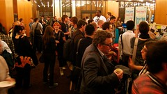
FOWD

The reception areaGraphic Design posterToday I went off to FOWD, I really like conferences because they just encourage and inspire you to do new and better things.  This was especially good because it was all about design and the stuff that I do day-to-day!  So there was Danny Sohmekh talking about Agile design processes, Jim Coudal talked about harnessing creativity, and Good Barry presented on how to communicate your skills in a society where design and websites are commodities.  My favourite presentations of the day were definitely Mike Kus' beautiful slides (supporting his talk about the importance of graphic design, the slides were very inspiring!) and Mark Boulton's talk on typography which is an area that I always want to learn more about. Microsoft did quite a cool story telling using their surface display which was fun. One of the best bits about it tho was meeting up with some other London web designers... I hope we can continue to network in some way, as being the only designer at work does have it challenges sometimes!

All of the presentations are now available for download; if you couldn't come along then definitely check them out.

*cutest stamps ever*

Cute turtle stampI found these today, I think they are just SO cute! I have a bit of a problem tho when I see things on Etsy, and at markets too - I keep thinking "I could so make that", but then I never get round to it.  One day I'm sure I'll just go ahead and buy the superflous cuteness, but for now I'm going to continue dreaming of making my own and see if I can find some rubber and make a cute stamp for the labels of my hand knitted baby gifts.

Dear hand bag theives...

... please return my hand bag.  Feel free to take all £3 cash that was in it, but please return my wallet which I was rather fond of as I bought it while our friends Jonny & Naomi were here so it reminds me of our outing to the markets that day.  Don't bother trying to use the debit card, I've already blocked it.  Feel free to take the cell phone, but please return the sim card so that I don't miss any calls, there was only about £2 credit on it so you're not missing out on anything there.  Please hand the stuff you don't want (but is still meaningful and useful for me) back into the Ping Pong restaurant.  Thank you in advance!  Rachel.

3 year anniversary of my blog

Crazy... my blog is 3 years old! YAY HAPPY BIRTHDAY WEBSITE!!! Given my tendency to avoid everything computer-ish after work I do think I've done pretty well to post something every month over that time... I guess it goes to show that something can take shape over time.

There has also been a redesign for every year, but I think I'm pretty happy with this design so might stick with it for a while longer, what do you think?

Hugest ever thanks go to my brother Paul for all of his help and hosting!! :-)

Symmetrical Nature

Park at North Greenwich On Saturday we went to the O2 arena to try and see the Red Bull Air Race; but of course we were too late for some tickets.  We did see some action from afar tho, some pretty amazing moves as the planes flew around (the photos don't do it justice!) At the nearby park there are some young trees planted in perfect grids and trained to be perfectly straight.  I find the play off between perfection and nature fascinating, like how perfect and symmetrical leaves are, and yet how nature is so chaotic and although it's symmetrical it's never quite perfect.  Or a very straight tree trunk, but with big knobbly bits on it.

My new Canon 450D

Orchid Thanks to an extremely generous leaving present from my boss in NZ, today I finally bought a digital SLR! I chose the Canon 450D, just with the kit lens at the moment. The orchid was handy and pretty, so here's my first shot! Thank you so much Graeme I'm gonna go nuts with this thing on all of our travels!! :-) I realised that this is actually my first ever camera after 10 years of photography,  up till now I've always had my dad's old film SLR. I wonder what difference the digital camera will make to my photography...

My art history geek out

Today we visited Cambridge Museum... It is a cool building - all Roman like, with the columns and stuff. I knew there was an exhibition on about Chinese flower paintings, so we thought we were going into that, but instead walked straight into a room filled with French Impressionist paintings. I thought I'd died and gone to heaven! Monet, Pissaro, Cezanne, they were all there - for free!!! I was just in a trance; beautiful,  beautiful artwork. We wandered through a huge variety of stuff, antique furniture, sculpture, English china (Mum - you would love that!), medieval artwork (it was nice to see such decadent ikons after visiting Ely Cathedral, so bare and empty). There was a late renaissance gallery of Italian work which I liked, very emotive and passionate. Then there was an English artwork gallery that ironically had French cubism and early modernism in it - more Cezanne, and one of my absolute favourite high cubism pieces - JUST SITTING THERE ON THE WALL IN CAMBRIDGE!!!! So yeah I was blown away.

Then we went downstairs and saw ancient carvings, like 750BC stuff, and then more ancient Egyptian stuff, ancient Greek things, it was amazing. Then there was a gallery of medieval European armour, that was really scary - huge double handed swords taller than I am, and a setup of a knight on a horse, that freaked me out too cause my vivid imagination was thinking he was going to attack me. Very scary.  And that was our adventure and I was very excited for the rest of the day :-)

News

Visual diary showing sketches of this blog designI know I've been rather remote the last week. But if you notice all the changes to this site then you'll know why! A brand new design, a new maemay address (thanks Pauly!), and a lot of Wordpress/PHP learning ;-) Oh and check out the Portfolio section. It's something I've wanted to get up for ages, and now it's finally done! I especially like having my visual diary up, it's too bulky to bring overseas with me, so I scanned the pages that give me the most inspiration so that I can continue to refer to them. We now have tickets booked too... We're leaving on the 25th April and spending a couple of days in Hong Kong before we get to the UK :-)

But when we get there... who knows! All of our plans for places to stay in London have fallen through, so we might actually do a bit of touring around when we first arrive, and go to London later instead. At least we do already have a bank account setup which will be a huge help. Kinda scary though, all the savings emptied and the many NZD converted into what looks like a pitiful amount of GBP.  The exchange rate is good right now, but it's still almost 3 dollars to a pound...

And the Canon 450D is finally in NZ... very tempting. Do I spend my last bit of NZ savings on it, or wait till we're overseas??

Interaction design goodness

Today I'm at Amy Hoy's workshop on interaction design. They have wifi in the workshops *yay* it's so nice being connected through the day! Before morning tea she covered the basic principles of usability and interface design. Out of the three layers of interface (Expectations, Direct interaction and Behaviour) the only thing that designers can have an impact on is the direct interaction layer. And the whole thing with usability is not a science, but relevant to the audience and people who use the site or application.

Initial principles cover basic layout such as top to bottom and left to right orientation (e.g. typically a logo should be in the top left as that is the most prominent area). This also applies a lot to sidebars - left sidebars get tuned out a lot – and although they do not interrupt reading flow, they also do not command attention (navigation blindness). Right side bars are hard to tune out – which can be good or bad. They interrupt with reading flow, especially if jagged edge on right. Bad to use if centre content is critical, but good for attention.

Without sidebars the content is much more readable. She suggested picking one sidebar layout – they both have different properties so test with your audience. Without sidebars, the content is a lot more readable - and if you need to have columns try to keep it to one sidebar.

Website visitors often just simply satisfice - choose the closest option to what they're looking for. This is really bad for experience, making it very hard to find information or reach your goal. Things need to be obvious and at surface level.

When designing a website (and by that I mean information and structure, not just graphic design) try very hard to make your priorities the same as the visitors.

Visual perception (e.g. Colour, Shape, Size) can be more predicable and easier to measure (based on Western society). Things like the colour red = stop, warning, no, error. In this area, conventions are good and should be used to avoid confusion.

And over and over again she emphasised that all of this is relevant to audience and their experiences. It's not an exact science and theory will not provide all the answers we need. Studies, research and analytics are not a substitute for thinking and testing. Real life is difficult to measure and people are complex. Target your audience, not using generic reports where you don't know the content, or the people, etc. It's not until you get feedback from your visitors that you can start to gauge effectiveness of your design.

Form design – the most dreaded beast. Always ask first: do you really need a form? They are hurdle for users, eliminate them where possible. What can you eliminate? Do you need to ask their country - or can you use the IP address and then check that your assumption is correct? Remove the barriers.

Breaking a form into sections creates a sense of accomplishment. Inline written content is useful, e.g. "I rate this at [option] out of 10".

Error messages are a classic mistake of form design. Often they are poorly written and not helpful. Again, try to remove as many barriers as possible - use red, make them jump out, position them next to where the fault is and ensure they are written well. Even better - eliminate the use of error messages by just dealing with the "incorrect" input. For example if a message in Twitter is too long, they just trim it down and let you know for next time. Gmail has an undo feature for deleted messages.

We want to leave a positive and fun impression on visitors so that they come back, recommend it to friends, etc. However, the way we remember things is not how it really happened – things are rarely as direct as we remember. The beginning and end are the most memorable to people. Negative things are also more memorial than positive things.

She wrapped up the day challenging us to not get locked into method, but instead look at things creatively. This allows for truely new innovations, for example the iPhone was never user tested outside of the Apple team working on it - and yet it is such a successful and wonderful interface. Don't lock out innovation with convention.

Amy Hoy's site with the list of links from her presentation.

CraftStock

Craftstock posterIn the webstandards email today they announced a combination of two of my favourite events... Craft 2.0 and Webstock blended becomes CraftStock! It is such a cool idea and normally I would be writing a post that used an excessive amount of exclamation marks to convey my excitement... but this is almost like salt in a wound for me... (so instead there are excessive amounts of ...s to convey my sadness...)

I can't make it to Webstock this year because a close friend of ours is getting married at a farm two hours drive from Kaikoura over the 14th - 17th February, and Aaron is going to be the best man. Andrew is the sorta guy that is so lovely and such good friends to Aaron that he considers him more of a brother than a friend. There is totally no way I can go to both, and family/friends comes first.

But it's still gutting because there are so many awesome speakers - I was especially looking forward to meeting Jason Santa Maria - and it's encouraging and refreshing to go to a conference like this and get that input to your day to day work.

BUT no doubt the wedding will be lovely and will be well worth the sacrifice ;-) After the wedding we're going on a holiday around the top of the South Island, it will be very nice to relax, get some sunshine, and have a break.

I love Meomi!

Screenshot of the Meomi website header Okay Meomi Cloud House has to be like my favourite site ever! Cause not only does it have really cute graphics and awesome desktops for download, but it also has a really nice combination of static and interactive features. A lot of sites are either Flash for HTML - or if they are are HTML they may include Flash elements like galleries or maps. But this site has a really nice blend of the two... it's HTML content and stuff which makes it easy to read, etc. but then it's surrounded by the cutest little bits of Flash ever. Each little scene going up the side of the tree and at the top does it's own little movement and sound when you hover over it.

Flock is so cool

Screenshot of FlockThis is awesome - I can write a blog post right from my browser hee hee Recently at work we were talking about social networking blah blah, so Graeme and I downloaded Flock - which is a web browser based on Firefox, but with all of your social networking stuff right there at your fingertips.

It's quite confusing to start with, but I have logged into my Flickr account and wrote this blog entry right from the browser window (instead of having to visit my site, login, etc. etc.)

Give it a go - especially if you're into Facebook or something!

Blogged with Flock

Sites I love

Some more very cool illustration design sites that I've found and love: hip.young.thing. This website profiles art, design, fashion, etc. and is updated really often. There is such a huge variety of really cool things on there.

Ghostco illustration with skeleton and skin layerghostco I really love this guys illustration - he is very amazing. I find his skeletal work especially interesting, as one of the papers I did at uni was just focussed on skeletons, muscle structure, then skin/outer layer. I love the way he makes each layer see through, so the structure is visible.

Emil Kozak This guy is awesome - he's a designer and artist and he's done artwork for skateboards, etc. etc. I love his stuff :-)

Cool website of websites

Cute gnome on ABC websiteRecently I stumbled across this website which is another website full of cool websites. Normally I'm only checking out gallery sites from Web Standards related groups, but this site profiles many Flash sites and a huge variety which is nice :-) Three of my favourites are: Ragnarok I have no idea what this is, but I would love to know! It looks like anime or a game or both? If anyone can translate I'd be grateful! I love fantastical stuff and I love cute stuff, and this combines both.

ABC Land The Japanese make everything SO cute!! This is apparently a real estate agency. You can make the gnome jump onto the branches of trees and roofs until he reaches the castle in the sky. I love the illustration and stuff! This site takes a while to download.

Farm Fashion designers?? Anyway a very cool site and I love their little cute things around the site :-)

Drawing tablets are fun!

Today I *finally* got my wacom tablet. Courier Post had it for almost a week, didn't deliver it correctly, were rude to me on the phone and so much for next day delivery aye! But that's another story - just don't use Courier Post if you want to get your stuff delivered professionally!! :-P Aside from that - the tablet is awesome it is so nice to use. (For anyone not so techy - it's a sensitive square and a special pen that allows you to write into your computer and also has pressure sensitivity.) I just got a basic wacom graphire, the cheapest on the market at $160.

By far the best is Photoshops understanding of it, the paint brushes are so much easier to use with the pressure sensitivity and it is so much faster to cut photos out of their backgrounds. I did this little photo cut-out and drawing this afternoon.

I have to say that this also made me discover something that I like about Vista - the built in tablet stuff is really useful. You can write in any application. To start with it couldn't understand my handwriting so well, but in the short time that I did it either I was learning or the computer was! it is still a much slower method than typing tho and too easy to make mistakes. One thing did dash my hopes tho - you can set customisation for an item and so i was hoping to set the right-click method to be Ctrl-click cause that's what I'm used to on a Mac and found I was doing it by habit on Windows. But no, the customisation in Windows seems to be limited to a couple of pre-setup options :-(

On the mac, the input is brought even another level cause the mac understands the pressure sensitivity as well as the handwriting. it is much easier to do the handwriting on a mac, not sure why but it comes out less scribbled. But unfortunately the character recognition is really bad, it could only understand one in every few words I wrote. But then I do have an older version of Mac OSX - I'll be excited to see if there has been development on this.

It will definitely be something that I'll use day to day instead of a mouse and for painting/drawing. :-D The writing thing is cool but typing is just faster and more accurate for me.